

Baseball Fonts: Why They Matter on a Jersey
Fonts are one of the most recognizable elements of a baseball uniform. While the colors and logos grab your attention, the lettering adds a touch of style that pulls the uniform together. Even though it isn’t the most recognizable piece of the jersey, it plays a bigger role than it seems. The font influences three aspects of uniform design: tradition, branding, and readability. Each style connects with a team in a unique way, so continue reading to learn about the history of baseball fonts, different font styles, and how they complete a uniform.
The History of Baseball Jersey Fonts
Early Baseball Uniform Lettering
Back in the 1800’s, people were focused on the visibility of their jerseys rather than the style of them. This is due to uniform letters being made of felt and hand-stitched onto each jersey. The process took a decent amount of time to complete, so the letters were very basic and easy to create. Each jersey featured a block style of lettering since it was the easiest to cut. Despite their simplicity, the early lettering styles established a foundation for teams to build around for decades to come.
The Rise of Script Logos
As baseball became more popular throughout the 1900’s, teams began to add variations to their uniforms as a way to stand out. This ultimately led to the rise of script font lettering on jerseys. The cursive fonts flowed across the chest so smoothly that other teams began adopting this style. Script styles gave uniforms a sense of personality and helped to distinguish teams easier during play. It instantly became a hit in the baseball community and, since then, has been associated with tradition along with classic baseball aesthetics.
Iconic teams really popularized this look when they played. Everyone wanted a script jersey, and it is even considered to be a retro look nowadays. Some of the current teams still embrace this look because of the history it represents and the classic appeal of the game.
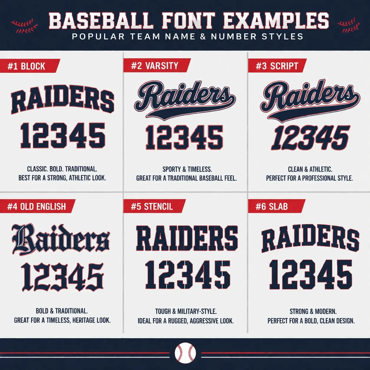
Some font examples popular in baseball today.
Bold Block Lettering in the Mid-Century
The 1940s and 50s were when baseball uniforms began to evolve again. Teams were experimenting with new lettering styles, colors, and the thickness of each letter. Their goal was to gain visibility for fans and officials seated far away. The stadiums were growing, and television broadcasts began, so there was a need to make uniforms easy to read.
Bold block fonts were the solution to this problem by making larger, clearer names and numbers. They utilized advanced stitching techniques and durable materials rather than the old hand cut felt they’ve been using. The letters were straight-edged and evenly spaced for structural purposes. New forms of lettering highlighted professionalism and brought a strong visual presence on the field, which is now a traditional aesthetic of baseball.
Modern Digital Font Design
Baseball uniforms nowadays use fonts that are created by advanced digital design tools. This tech gives teams full autonomy to create custom lettering and apparel to match their branding. With this, designers can adjust the spacing, curves, outlines, colors, and much more to create a unique design for them.
One advantage of the modern designs is the flexibility that comes with them. Alternate uniforms are easier than ever to create, so teams will change the lettering, fonts, and colors on their jersey to create an entirely new uniform that still matches the identity of the team. The fonts available today can be pressed on or stitched directly into the uniform; it all depends on the style of jersey you want for your team. Baseball jersey fonts have evolved a lot over time and have grown with the game. Each era has contributed various styles and innovations that ultimately shaped the uniforms that players wear and fans love.
You can see how the modern techniques allow for layering, and various design elements around the name.
Common Baseball Jersey Font Styles
Block Fonts
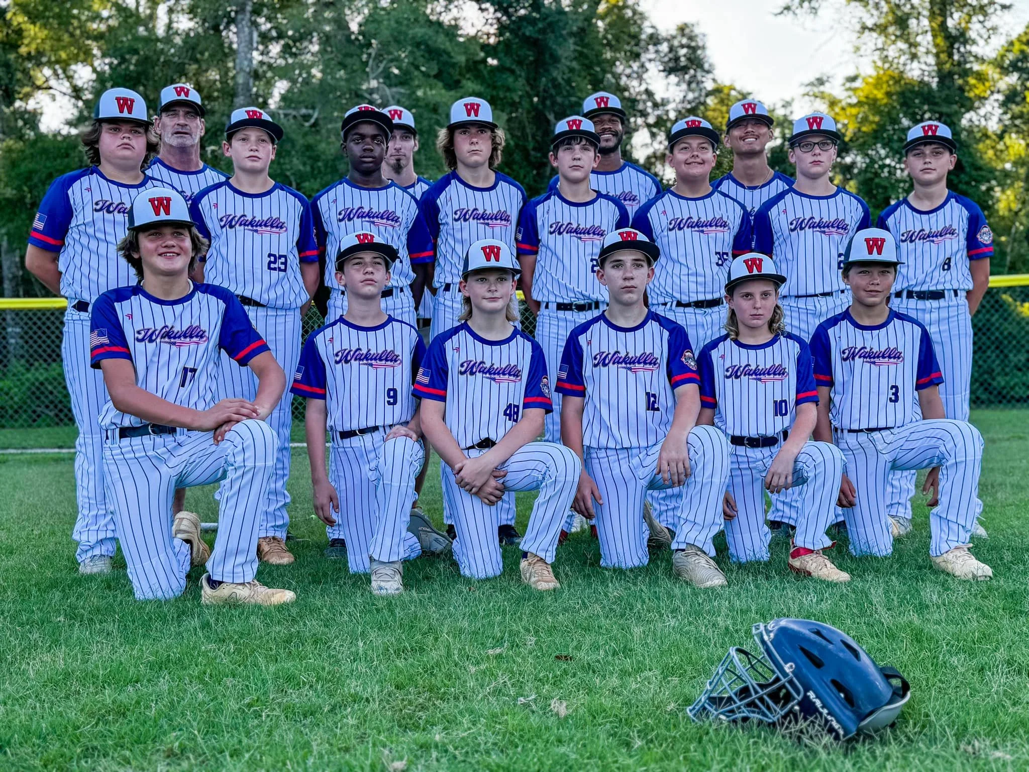
These are the most common font styles seen in baseball today. Block fonts utilize thick, straight lines and simple shapes to create each letter. This makes them easy to read from a distance, which is helpful to the fans and umpires watching the game. Block fonts are widely used at all levels of the game because they work well across various jersey materials and stitching techniques. They also work well with athletic design elements such as striping, outlines, and vibrant colors to enhance the visibility and overall look of the jersey. Block lettering is a major part of professional baseball’s history, as it was the common font of the 20th century until teams began to play with different lettering styles. As time went on, the league’s uniform rules loosened up, and stylized scripts became popular among teams.
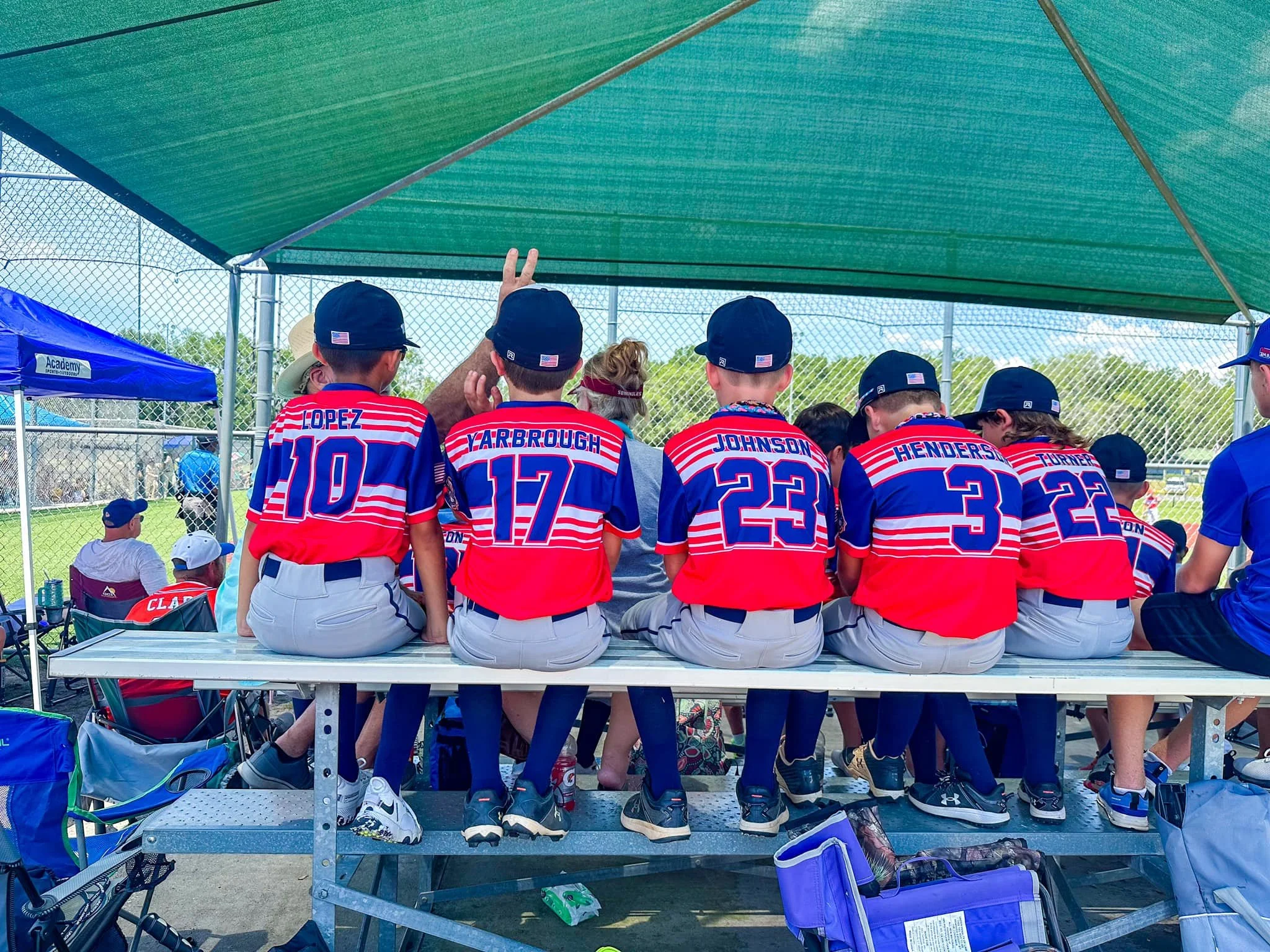
Script Fonts
Script fonts are one of the most recognizable lettering styles in all of baseball. They mirror cursive handwriting and bring an elegant look to each jersey. This baseball font features smooth curves and lines that seamlessly flow across the chest and produce a timeless appearance, which is why it’s been used for many decades. Script fonts began in the 1900s when teams began to experiment with their block fonts, trying to create a fresher look that fits with the team. According to the Baseball Hall of Fame, the first team to use script fonts on its jerseys was the Buffalo Blues in 1914. They were a part of the Federal League and showcased this unique style during that season. It didn’t have the traction it does now because, after that season, the script font fell out of style. That was until the Detroit Tigers brought it back in 1930, and since then, every major league club has worn it at least once.
Script fonts are arranged in an arch across the front of the jersey, but the severity of the arch can be altered so it lies flush with the natural shape of the chest. The curved design of the team's name produces a visually appealing effect that maintains readability. Thanks to its elegant appearance, this baseball font is associated with tradition and professionalism across more sports than just baseball.
Arched vs Straight Lettering
How teams decide to place their lettering can greatly impact the overall look of the jersey. Even if they’re using the same font, the way the lettering is arranged can affect the balance of the uniform, along with its readability. It's important to note the different lettering styles and how an arched or a straight letter can be more aesthetic on a jersey.
Arched Lettering
This form of baseball font lettering is exactly what the name describes. The font is curved, to a certain degree, meaning teams can alter how much arch they want in the letters. It can match the shape of the chest, or it can be more tame, closer to a straight lettering design, so that teams get the best of both worlds. Arched lettering has been in baseball for decades and is one of the most traditional uniform styles, typically being used with the script font. The curved layout allows team names to be stretched fully across the chest without altering the spacing between each letter. It’s able to do this in such a smooth way and looks its best on full-button down uniforms. Many classic baseball uniforms utilized arched lettering thanks to its ability to give the jersey a balanced and timeless appearance.
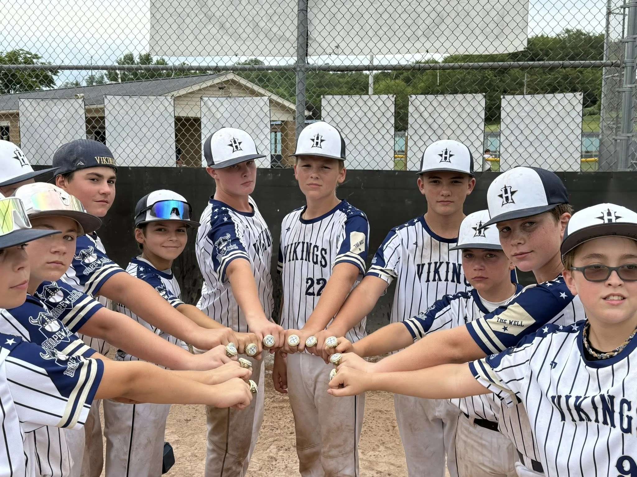
Here’s the Hopewell Vikings showcasing their unique font with an arched style.
Straight Lettering
Straight lettering is the complete opposite of arched lettering because it presents a flat logo across the jersey without the use of curves. Instead of following the natural shape of the chest, the letters are aligned in a straight horizontal line from one side of the jersey to the other. This creates a clean and structured appearance that many teams prefer when they want a modern and minimal look.
Due to its simplicity, straight lettering is often associated with more contemporary designs. It removes some of the decorative flair that arched lettering provides and instead focuses on clarity and balance. The result is a jersey that looks sleek, organized, and easy to read both on the field and on television broadcasts.
Fonts as the Identity of a Baseball Uniform
Baseball fonts may not be the attention getter of a baseball uniform, but they play a major role in how a team’s uniform looks. They’ve seen many stages of evolution, from hand stitched block lettering to digitally designed letters, and fonts have helped improve the visual identity of uniforms at all stages of the game. Each style can communicate different meanings depending on the design of the jersey. Ultimately, the ideal baseball jersey font must strike a balance between readability, style, and team identity. The style or colors of a uniform might get your attention first, but the font is what ties every aspect together. Be sure to check out our store to fully customize your team's baseball uniforms!